Dear Reader:
Nintendo explains, defends Metroid Prime: Federation Force art style
Coming from a Kotaku interview with Kensuke Tanabe...
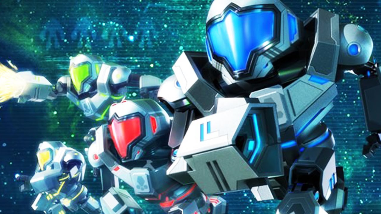
After completing the development of Luigi’s Mansion 2, we started working on this project with development company Next Level Games. At that time we had many discussions about how to make a multiplayer gameplay experience great on a handheld system: things like map loading time, the number of enemies we could display at a time, etcetera. There were many technical hurdles to face. But, most of all, the biggest issue was that objects you need to shoot will be so tiny on the small screen of the handheld system. That is why we decided to change things up and use this more rounded art style for the characters.
If you make the characters more rounded, enemies also become more compact, and you can display larger groups of them. Also, we compressed the surrounding terrain vertically, based on the characters’ proportions. So the amount of information we could display on screen really increased. This resulted in a different aesthetic, but we wanted to prioritize providing the very best gameplay experience. After that, we tested out a version of this art style and we confirmed that it definitely offers the best handheld experience in the Metroid Prime world. That’s when we gave the go ahead to proceed in this direction.