
Dear Reader:
Nintendo shares insight into the creation of the Switch's operating system (design takes up less than 200KB)
Earlier today, we had a quick summary of Shigeru Miyamoto's keynote at the 2018 Computer Entertainment Developers Conference. That wasn't the only presentation Nintendo hosted, though. The Big N also put together a keynote on the design of the Switch's operation system. We have details from the keynote courtesy of the Wall Street Journal's Takashi Mochizuki.
- Switch's OS concept was to make something easy to use & light
- Nintendo focused on the sound effects & animation with Switch OS, but didn't include background music to keep things quick
- Nintendo wanted the OS to feel 'comfortable,' and made a great effort to cut out elements that lead to discomfort
- text is sometimes better than icons, as some icons may leave players/users puzzled upon first glance
- one goal was to cut the amount of actions a player needed to take in order to achieve the results they want
- when choosing options on the menu, 'Yes' was left as the default option in order to speed up interactions
- menu animations were kept short and snappy, and were put in place to help the user navigate
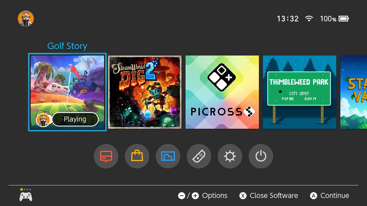
- Switch's home menu design resources take up less than 200KB
- Nintendo sees the process of using the an OS as players making a selection, confirming it, and then waiting for results
- the NES was used as a reference when creating the OS, as the NES let players jump into a game right away
- sound effects were carefully chosen/timed to go with on-screen actions to help make navigation easier/more impactful
- virtual button layout for the OS was chosen based on where users would expect the cursor to move next
- Nintendo wanted to separate games from non-games on the OS, and adjusted size/color/density on-screen
- Nintendo liked the to-to-bottom approach, and wanted the screen to be as uncrowded as possible
- another goal was to not only make an OS that both appeared easy to use, and functioned as such